Brand Cohesion Matters in Creating Consistency
- TJ Smith

- Jan 16
- 4 min read
Updated: Mar 17

Brand Cohesion, who gives a shit? Well I do, and I guarantee your audience does too.
The moment your brand becomes disjointed, so does your message. And when that happens, you start the downward spiral of confusion, distrust, and abandonment from the people you're trying to serve.
I've watched this pattern play out time and time again. A business starts strong with a clear identity, then slowly fragments as they add channels, hire new people, chase trends. Instagram looks one way. The website another. Email campaigns feel like a different company. Before anyone realizes it, the brand language has splintered into dialects that don't speak to each other.
And it costs them. Real money, real opportunities, real trust.
EXAMPLE: CNMA
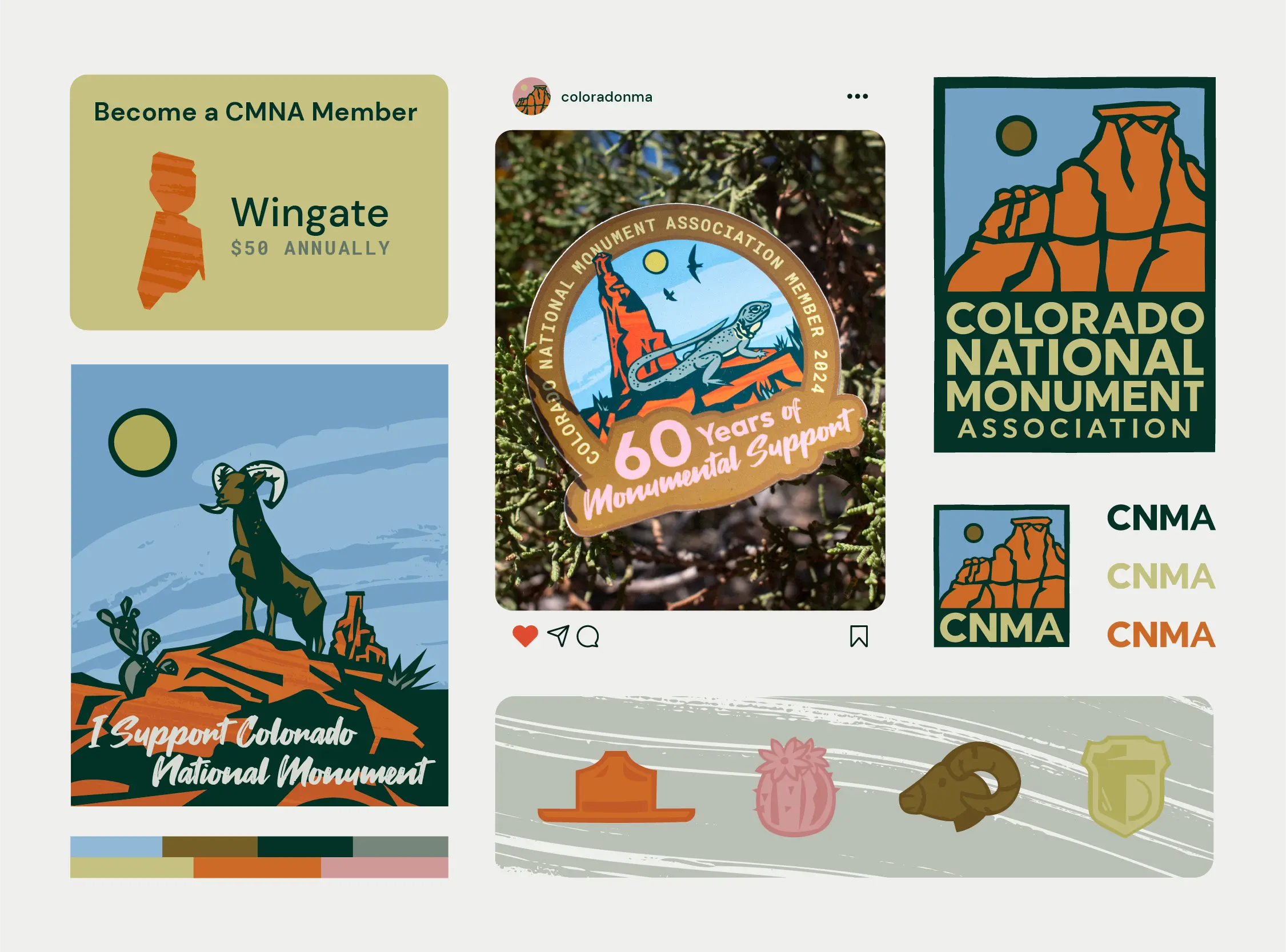
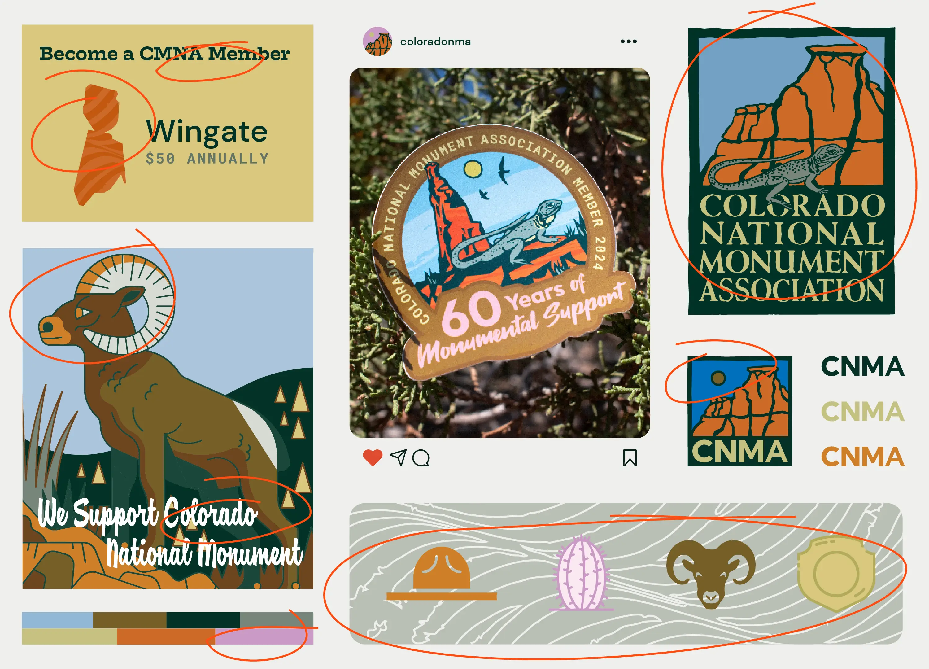
Notice how the cohesion breaks from example to example. Colors matching fails, illustration styles are different, textural elements are off. Too many font choices. None working as one ecosystem.
Why This Breaks Down
Us humans inherently look for patterns in communication. Easy ways to digest the info and act. But when your message has holes in it, your audience struggles to connect the dots. They feel something's off, even if they can't name it.
Trust gets built through predictability. Through showing up the same way every time. When your brand shifts from platform to platform, you're triggering that instinct that says "something's not reliable here." Your audience might not consciously notice your logo is positioned differently or your fonts have multiplied, but their subconscious is keeping score.
And here's where it gets expensive: I consistently see inconsistent brands working about twice as hard to get half the results. Turns out the research backs this up. Companies spend 75% more on media to achieve what cohesive brands do naturally. That's not a rounding error. That's the difference between sustainable growth and constantly hemorrhaging budget.
The System Problem
How do you keep consistency when your brand system is so large? Multiple touchpoints competing for attention among the ecosystem of your business: logo, email, social, website, print. All these pieces existing in their own spaces, often created by different people at different times.
It all starts at the beginning or re-beginning of your brand build. Thinking through the ways your audience will interact with you and creating assets that relate to one another. Assets that feel part of the same family. No weird uncles here!
Some simple examples: a defined color palette, a selected type suite, specific ways of showcasing photos. Rules for how your logo shows up in different spaces. If you have a specific illustration style (which you should), how it's used and how that style relates to the logo and other brand elements.
All of these pieces complete a puzzle and define a built system that becomes your brand language.
Here's what kills me though. Most businesses have guidelines sitting in a folder somewhere. They spent good money creating them. But nobody uses them. The guidelines exist in theory while the actual brand fragments in practice. Having pieces documented isn't the same as having a system that functions across your organization.
When It Works
When all these pieces work in harmony, your audience understands you with ease. They see a post in your brand style and immediately know it's you. Shortening their length of question and allowing your message to land faster.
In today's competing realm of short attention spans and mass information, having your message cut through the clutter is just good business. I've seen cohesive brands gain traction three times faster than their fragmented competitors, even with smaller budgets. Because they're not asking their audience to work so hard just to understand who they are.
Diagnosing the Breakdown
So how do you know when your brand is disjointed?
First, ask yourself the basics: Do we even have brand colors? Specific typography? A brand guidelines document? If you have none of this, your brand language is likely weak.
If you have some of these pieces, widen your scope. Look at 3-6 months of your communication messages. Emails, social posts, posters, whatever you've put out there. Compare them side-by-side next to your website and logo.
If you were to observe them unbiasedly, would you say they feel like the same family? Can you spot more than four different fonts being used? What do the colors look like? Too many? Are elements popping out as feeling like they don't match?
This could be a good indication that things are falling apart without you even knowing. Seeping into the strength of your brand's ability to message clearly.
The Fix
Not all is lost though! Chances are we can salvage the system by designing by subtraction. Looking at all that's been created and pulling out what's worked best to build upon. This approach takes your existing brand equity and tightens the system around what's actually resonating.
Or this might be a good time to start anew. Take what you've learned and create a system of cohesion right from the beginning. Build intentional relationships between every element so they work together instead of competing.
You'll need a designer to do that ;) Really, you'll need a brand designer who works in systems, not pretty pictures. Because what you really need is someone to move from big picture to small, connecting the dots along the way and creating thoughtful outcomes for all scenarios. A creative problem solver.
Someone who understands that your brand isn't just a collection of assets. It's an ecosystem where every element either supports the whole or weakens it. And in a market where most of your competition is operating with fragmented identities, cohesion becomes your competitive advantage.
The question is: do you want a completed puzzle or live with missing pieces?


