
Marks, Logos, Type
Logos
Logo Design
Creative Direction
Every logo starts with discovery. Before a single sketch, I dig into the organization, its history, its people, where it's headed. From there it's typography exploration, mark development, visual tone. Some logos I build solo, others in partnership with studios like Olab and Futures Bright, where the collaborative push sharpens the thinking. The goal is always the same: refine until the mark says exactly what it needs to and nothing more.
THE CHALLENGE
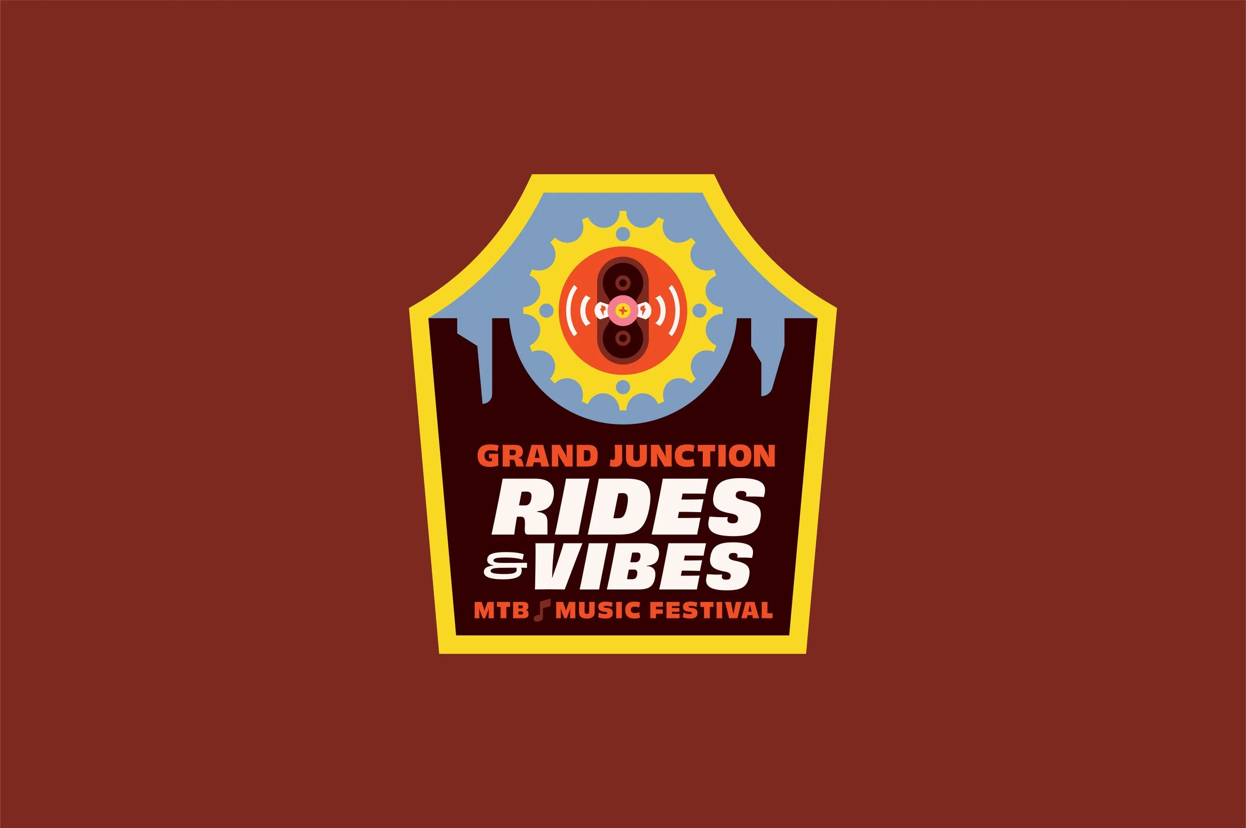
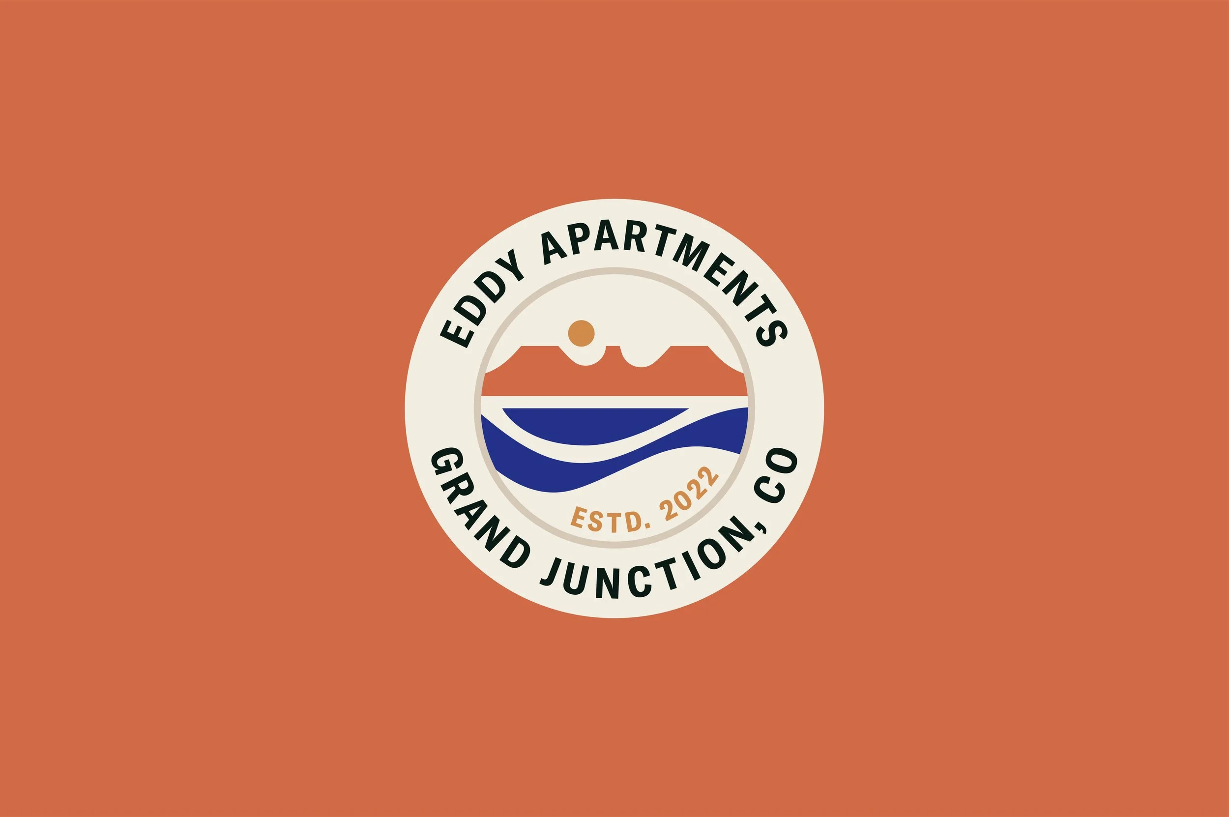
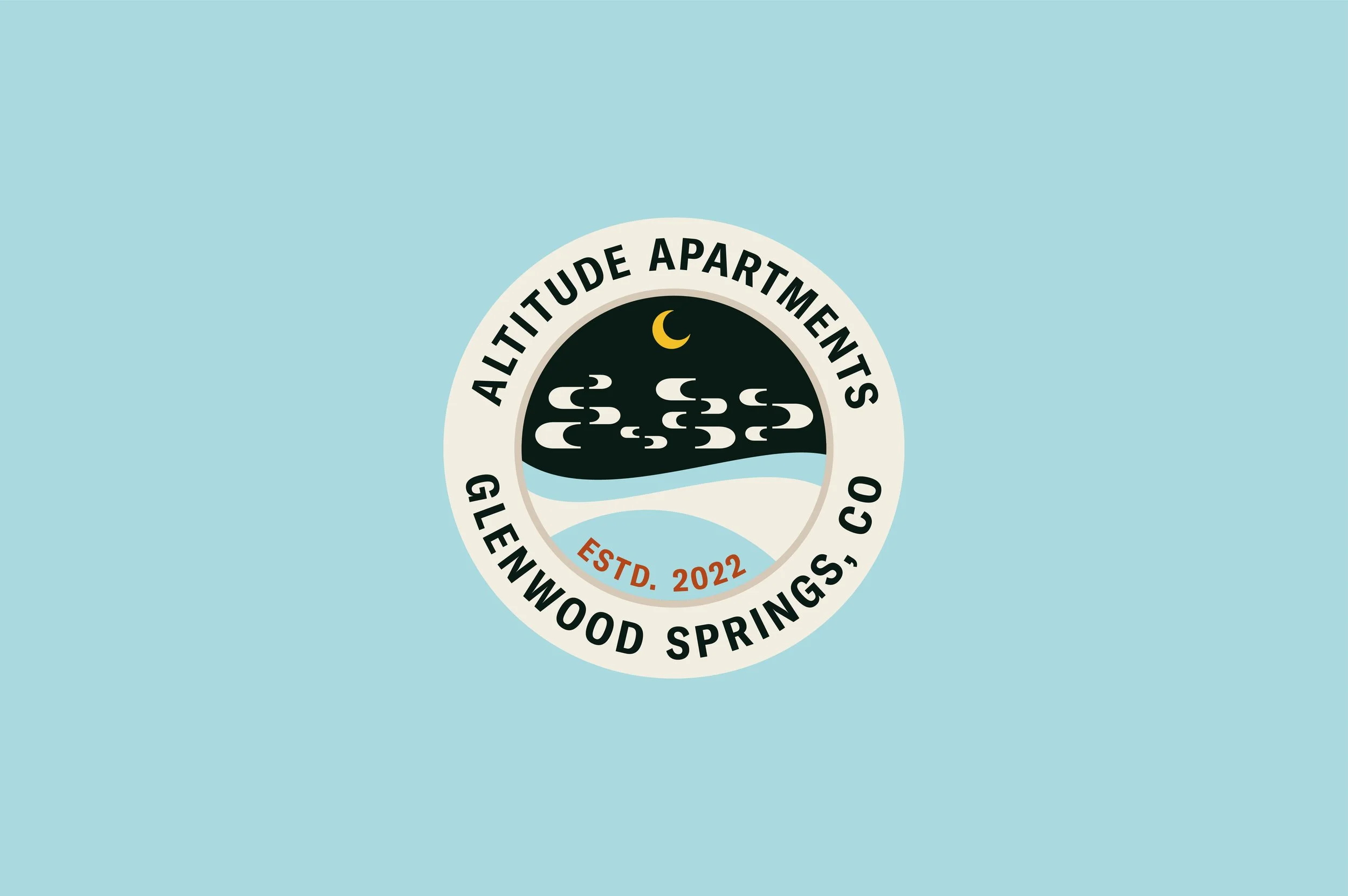
Every logo starts with the same question: how do you distill an entire organization into a single mark? The businesses and organizations behind these logos are all different. Nonprofits, restaurants, events, coalitions, coworking spaces. Each with its own mission, audience and personality. But the challenge is always shared. Build something that communicates who they are at a glance. Something that holds up at the scale of a billboard and the size of a favicon. A mark that feels inevitable, like it was always there, even when it's brand new. That's the bar. And every one of these started by clearing it.
THE PROCESS
A logo is the tip of a much larger conversation. Before anything gets sketched, I spend time understanding the organization, its history, its people, and where it's headed. That discovery shapes everything. From there, I explore typographic direction, mark development and visual tone, always working toward something that feels authentic to the brand it belongs to. Some logos are built solo, others in collaboration with partners like Olab and Futures Bright. The throughline is the same: listen first, design with intention, and refine until the mark says exactly what it needs to. Nothing more. Every logo in this collection was built that way.
THE SOLUTION
What you see here is over a decade of logo work. Marks for events that pack downtown streets, organizations protecting public lands, restaurants rooted in culture, and startups finding their footing. Each one was designed to carry the weight of the brand it represents, across print, digital, environmental and everything in between. A good logo isn't decoration. It's the foundation that the rest of the visual system builds on. These marks have appeared on murals, menus, trail signage, festival stages and storefronts across Colorado and beyond. They hold up because they were built with purpose. That's the work.
Approach
Every project follows the same process. One rooted deeply in the practice of our Signature Thataway Method. →

Solutions
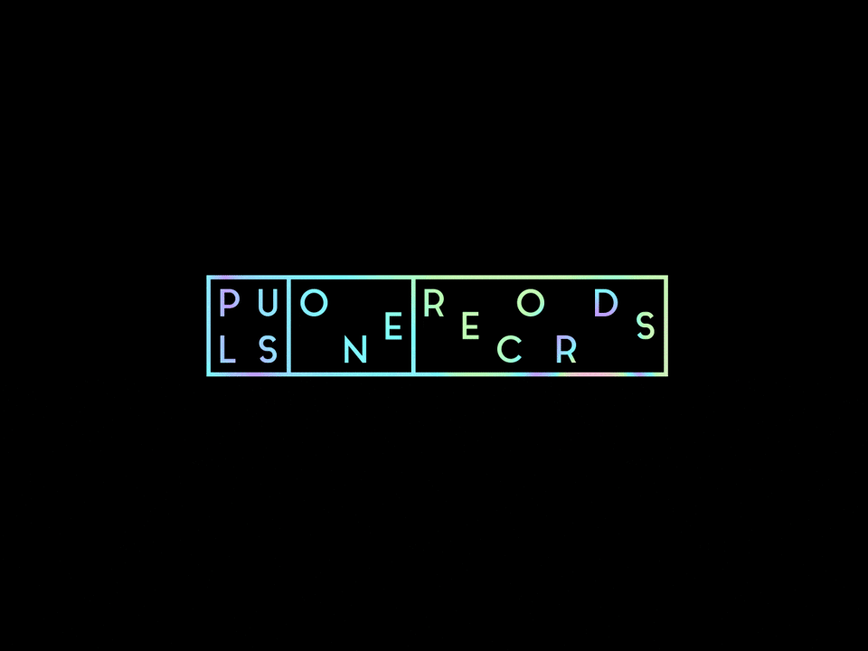
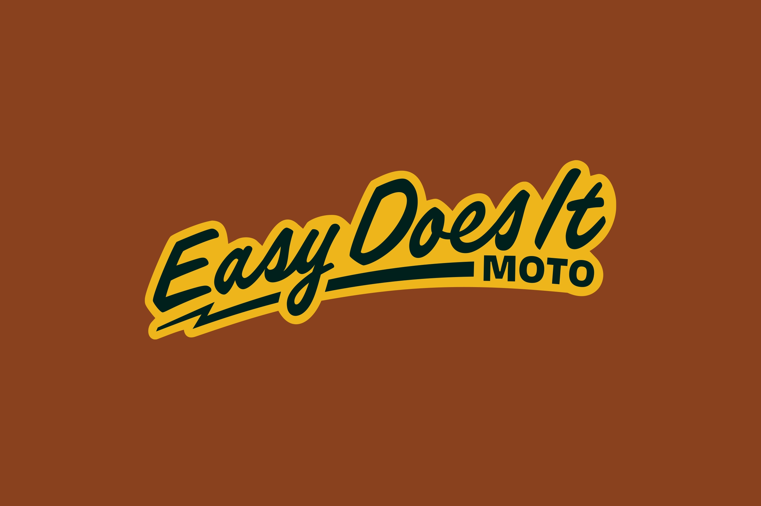
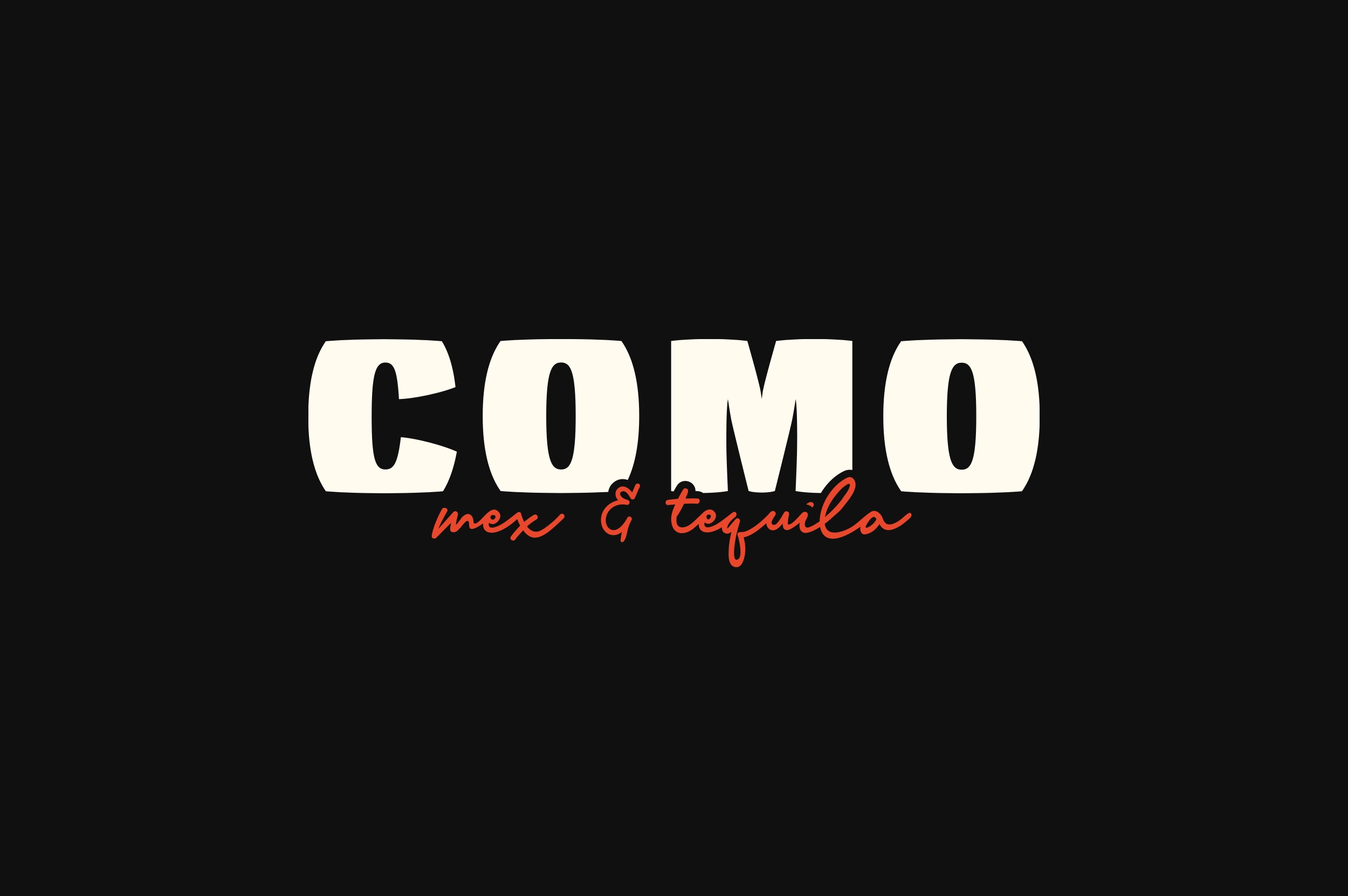
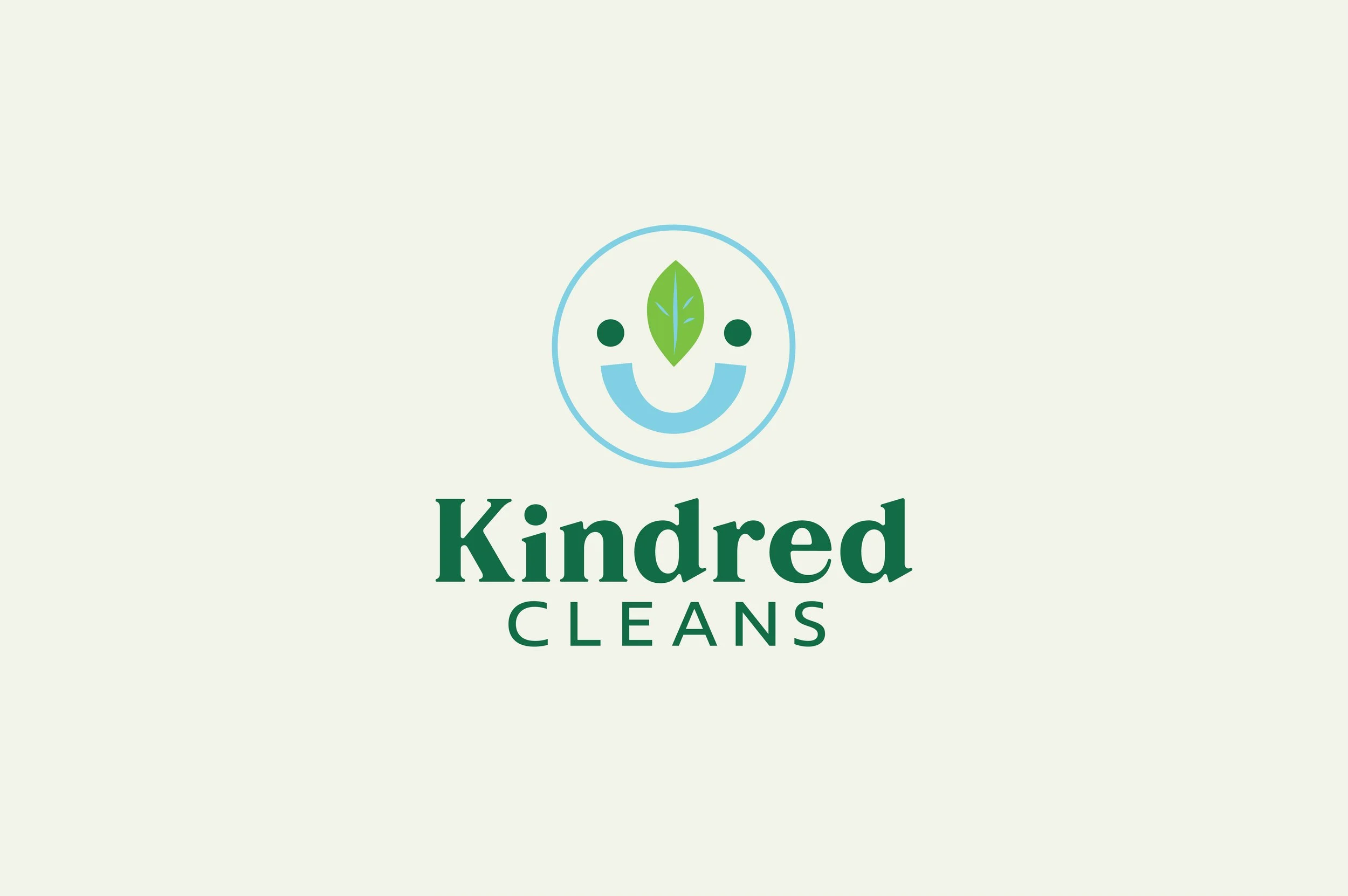
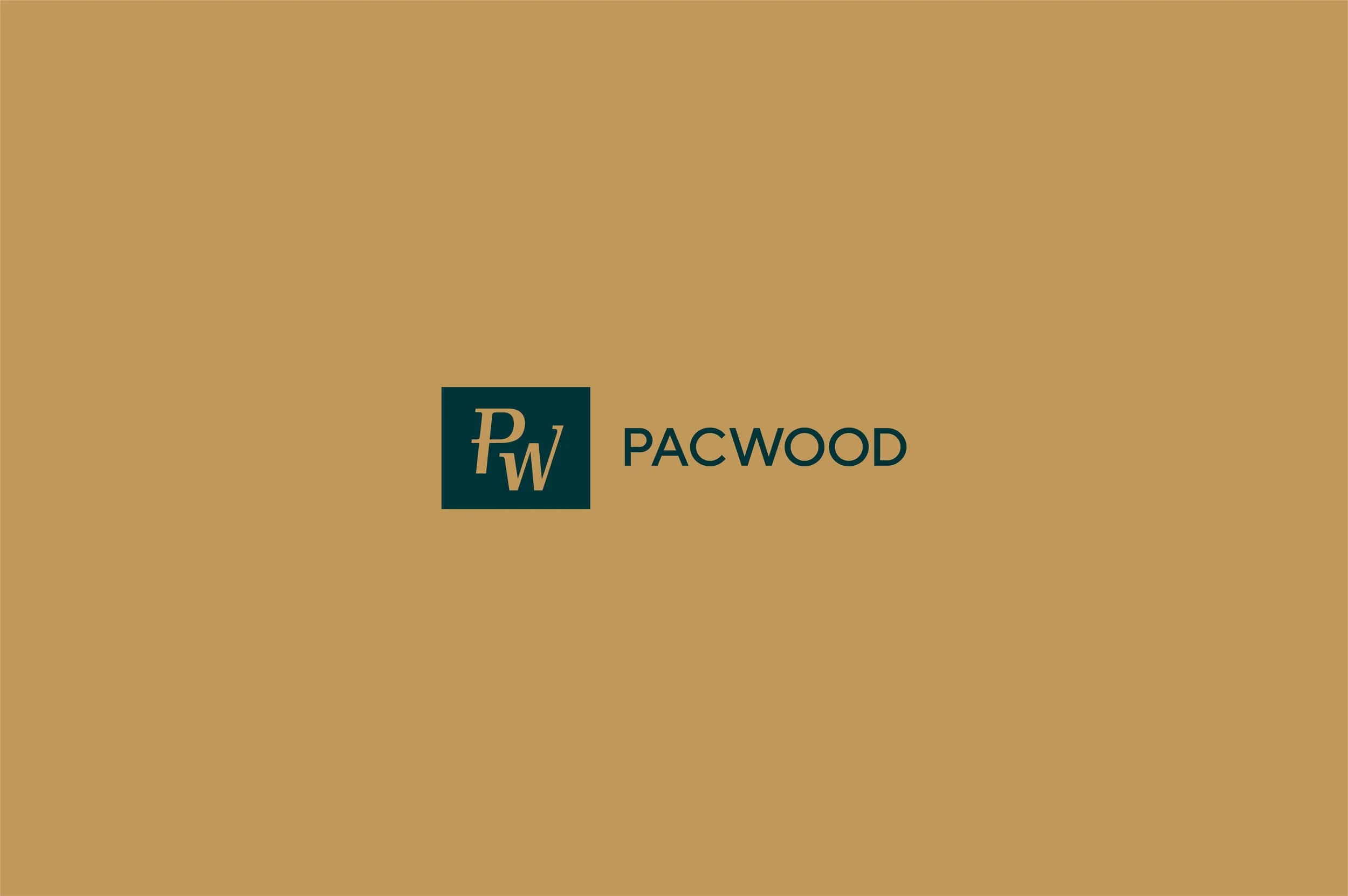
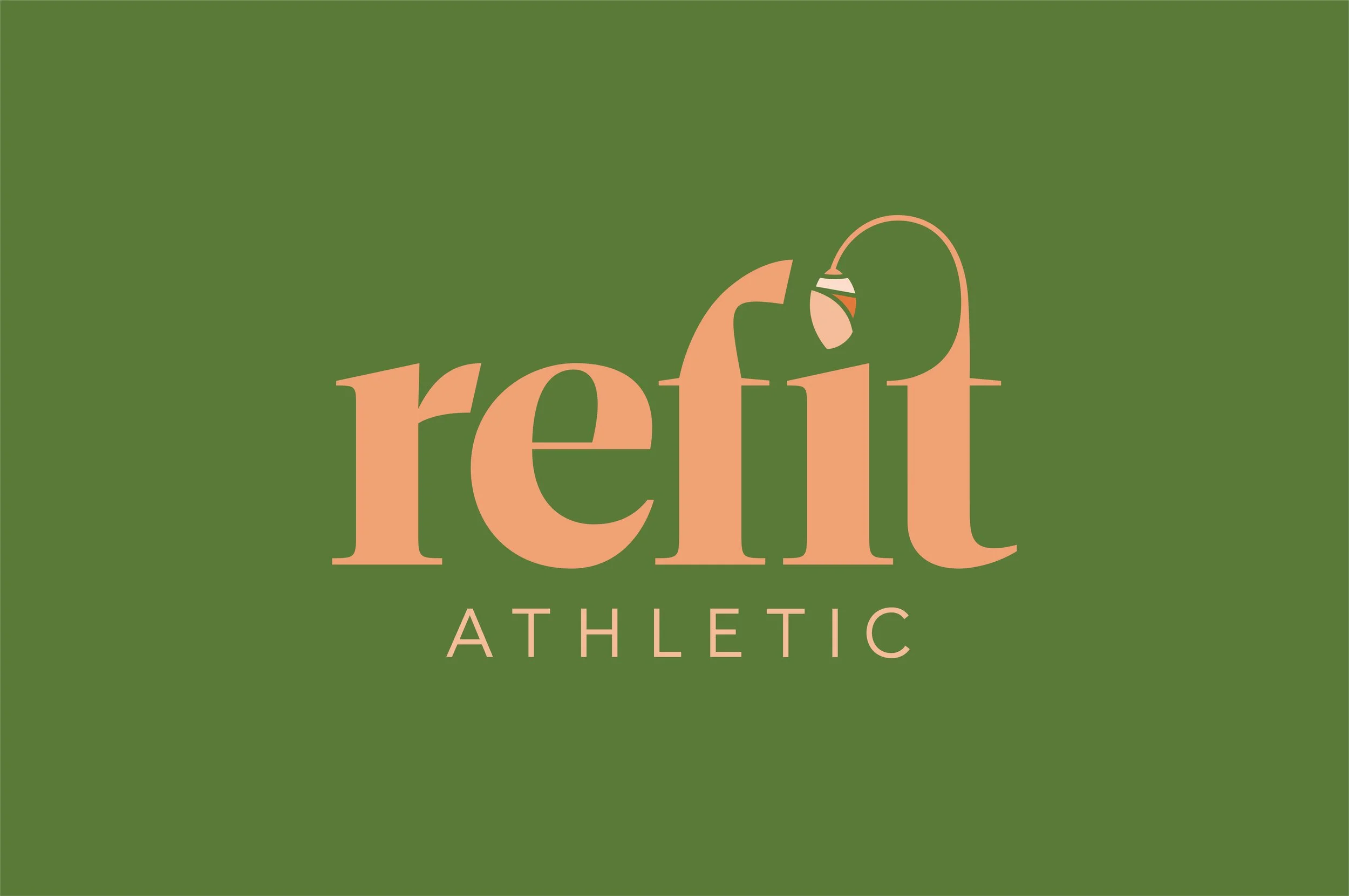
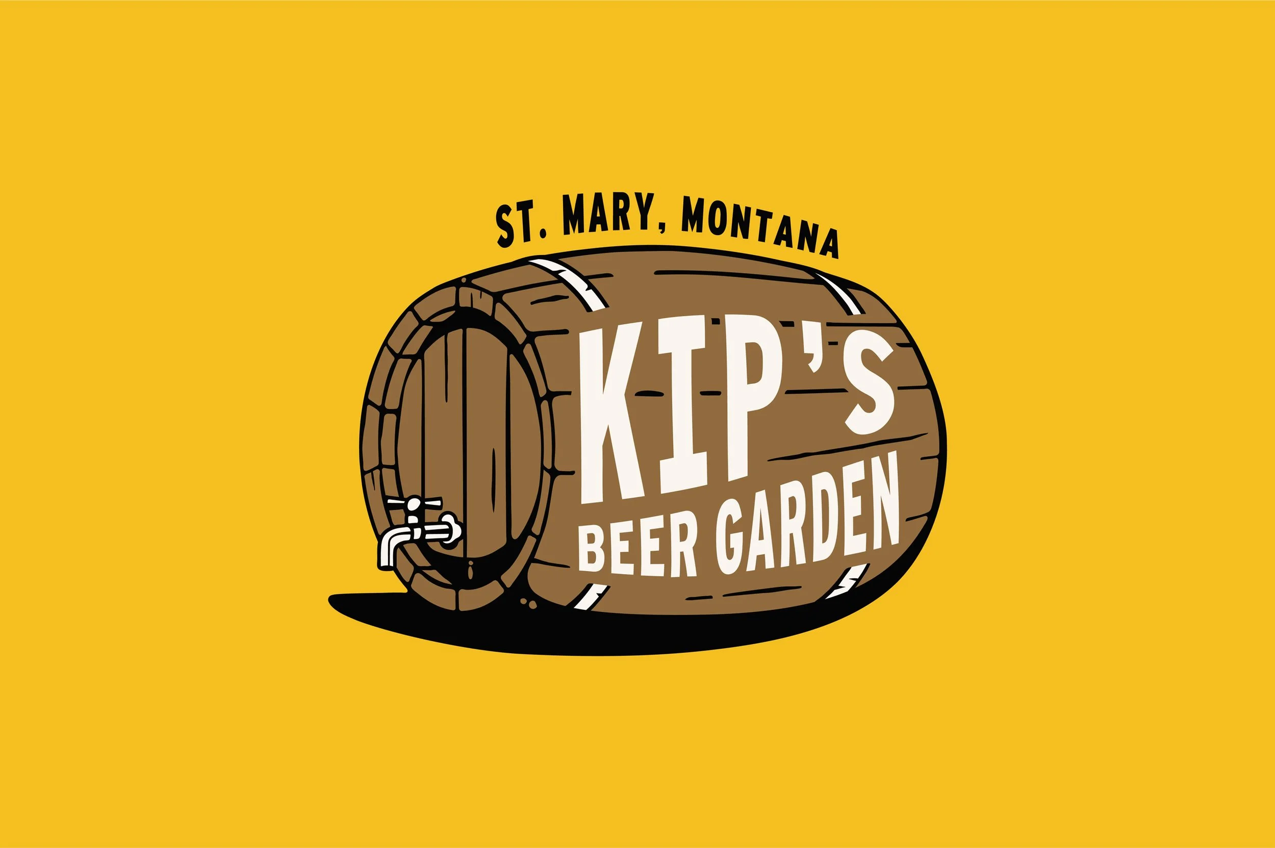
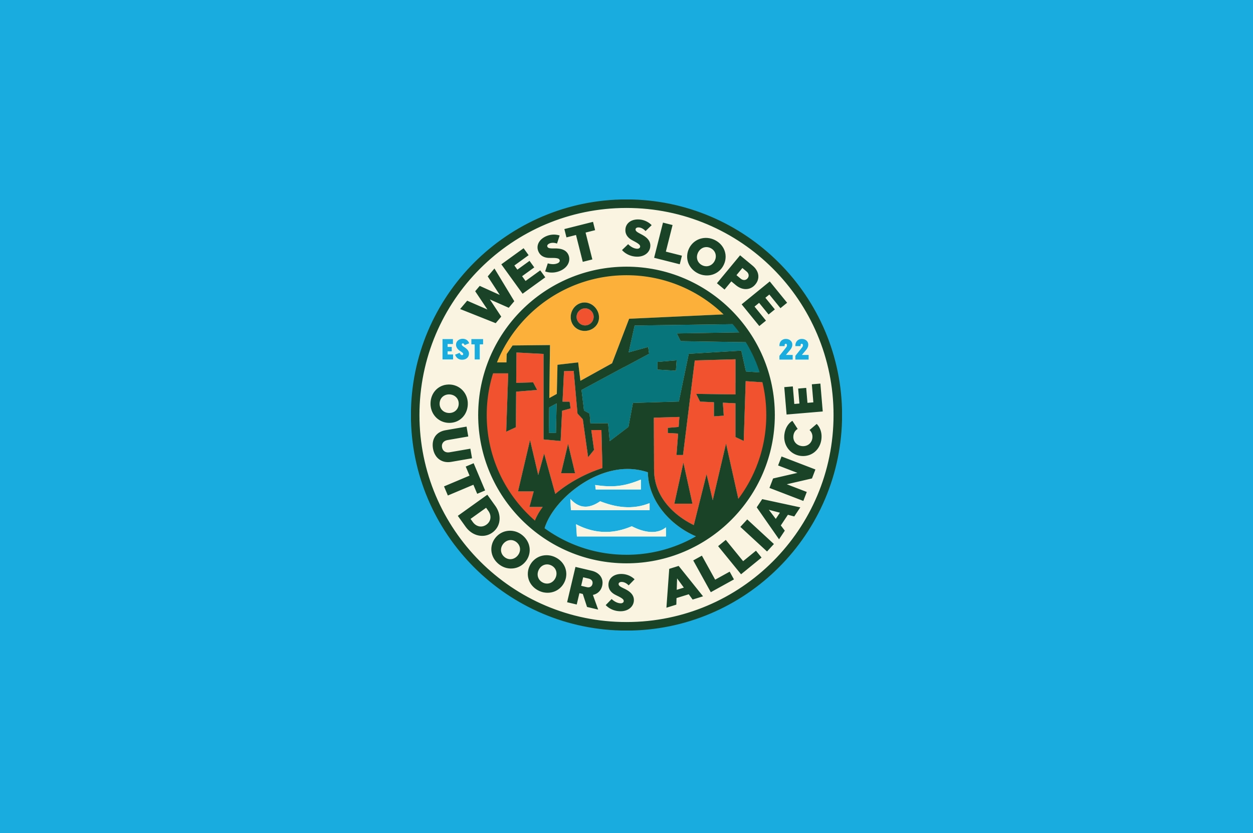
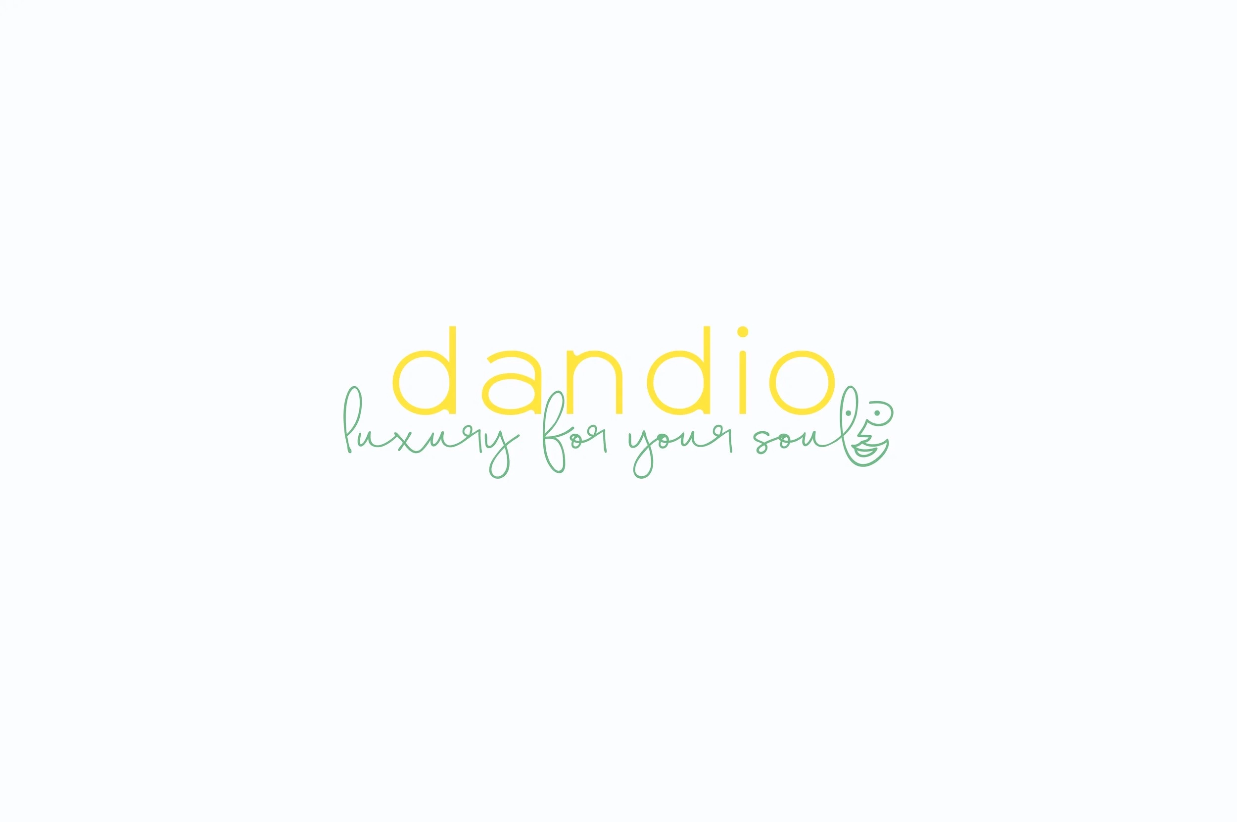
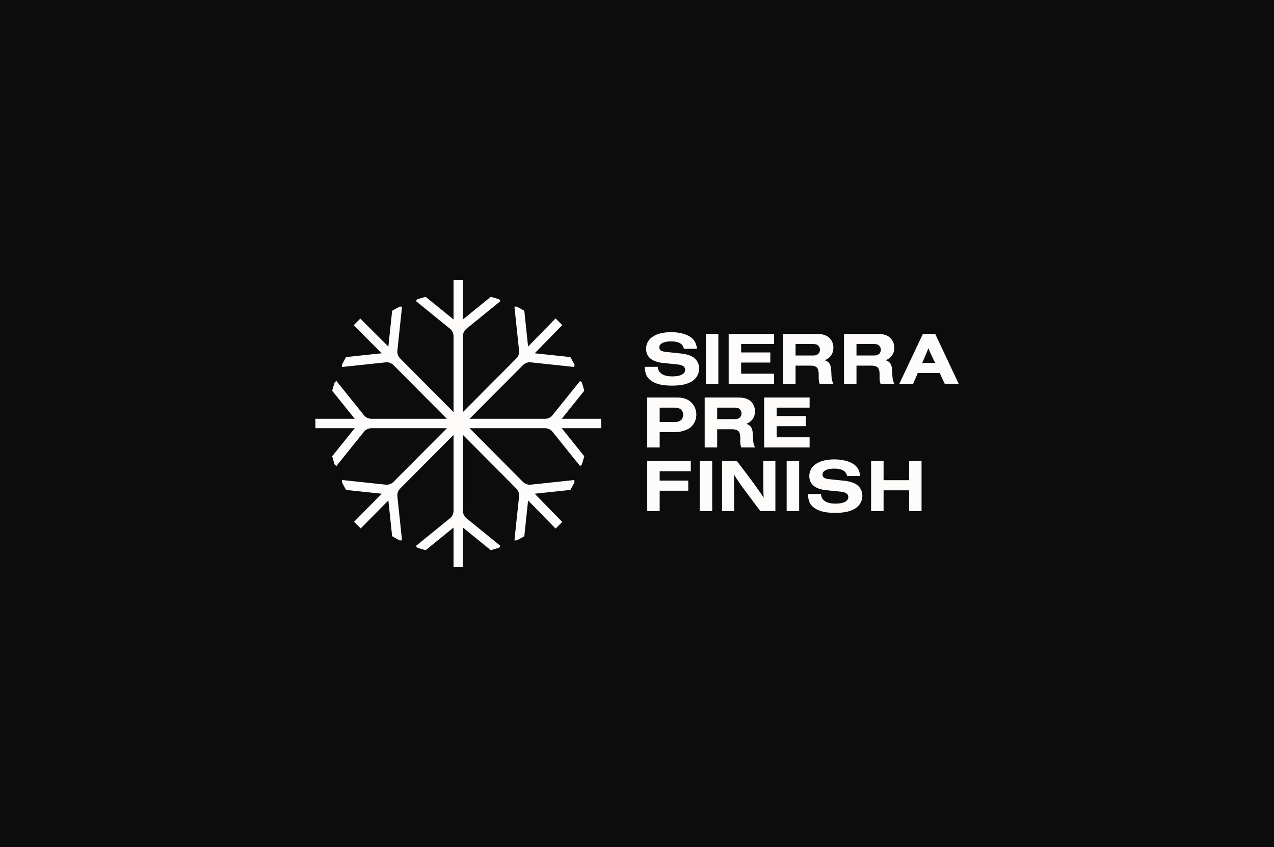


A library of logos from 2012 to present.